Material 3 vs Material 2: Key Differences Designers Must Know
Material 3 vs Material 2: Key Differences Designers Must Know
Material 3 vs Material 2: Key Differences Designers Must Know
May 12, 2025
May 12, 2025

In the ever-evolving world of UI/UX design, staying relevant means staying updated. As we step further into 2025, one of the most important transitions in interface design is the shift from Material Design 2 to Material Design 3 (Material You). While both originate from Google’s design ecosystem, their approaches are fundamentally different.
In this article, we’ll explore how Material 3 is redefining the digital design language, what has changed from Material 2, and why forward-thinking designers and developers should care.
What is Material 2?
Material 2 was Google’s refinement of the original Material Design principles. Introduced around 2018, it prioritized consistency, minimalism, and a universal design language. It offered:
Rigid layouts and component structures
Preset color themes
Emphasis on flat design with shadows for depth
Less personalization, more standardization
It was powerful, but lacked flexibility. In a time when users crave personalization and inclusivity, Material 2 began to feel... outdated.
What is Material 3?
Launched under the name "Material You," Material 3 is not just a design system; it's a design philosophy. It puts the user at the center by adapting to individual preferences, devices, and accessibility needs.
Material 3 brings:
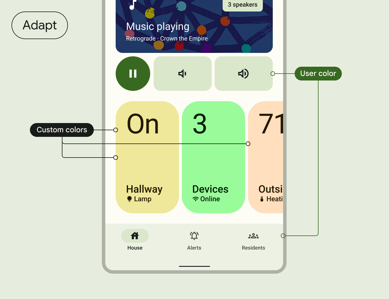
Dynamic color systems that derive from users' wallpapers or brand themes
Updated components with more flexibility and expressiveness
Responsive layouts that intelligently adapt across screen sizes
Enhanced accessibility baked into every element
A focus on emotion and motion, not just utility
Where Material 2 imposed consistency, Material 3 encourages authenticity and user connection.
Side-by-Side Comparison: M2 vs M3
Feature | Material 2 | Material 3 |
|---|---|---|
Color System | Preset themes | Dynamic, personalized color palettes |
Component Shape | Rectangular, sharp corners | Rounded, soft corners |
Layout | Fixed grid structure | Adaptive and fluid layouts |
Accessibility | Manual compliance | Native accessibility features |
Motion | Limited, mostly utility-based | Purposeful, expressive motion |
Customization | Minimal | Deep user and brand personalization |
This shift doesn’t just change how things look — it changes how people feel when interacting with your product.
Why Material 3 Matters in 2025
People expect more from digital products today. They want:
Interfaces that reflect their personality
Experiences that feel human, not mechanical
Tools that work well regardless of ability or device
Material 3 is a response to this demand. It empowers brands to build deeper emotional connections while maintaining design consistency and usability.
From a business standpoint:
You increase user retention through familiarity
You improve accessibility (a legal and ethical necessity)
You future-proof your product design against emerging trends
Whether you're redesigning a legacy system or starting fresh, Material 3 gives you a toolkit built for 2025 and beyond.
Practical Implications for Designers
1. Design with dynamic color in mind. Use Material Theme Builder to preview how your UI will look under different color palettes. Don’t hard-code colors — embrace the fluid system.
2. Think in motion. Material 3 uses motion to orient, inform, and delight. Subtle transitions, microinteractions, and feedback animations help users navigate without confusion.
3. Use updated components. Material 3’s components are not just visual upgrades. They’re optimized for usability, accessibility, and consistency across platforms (web, Android, iOS).
4. Design for responsiveness by default. Your layout should look great on a watch, a phone, a tablet, or a desktop. Material 3 makes this scalable by design.
5. Follow official documentation. Use m3.material.io for up-to-date guidance, patterns, and component specs.
Real Examples of Material 3 in Action
YouTube Music uses dynamic color to match Android themes, offering a deeply integrated visual experience
Google Calendar now features adaptive layout containers and clearer UI hierarchy
Pixel Launcher reflects real-time personalization with smooth motion and themed components
These aren't just redesigns — they’re reimagined experiences.
Final Thoughts: What Should You Do Now?
Material 2 served us well, but its time has passed. Material 3 is here to meet the expectations of modern users who demand inclusivity, beauty, and adaptability.
At Racool Studio, we believe design isn't static — it's alive. And Material 3 represents the next evolution in creating more human-centered digital experiences.
Ready to modernize your product? Let us help you migrate to Material 3 with confidence and creativity.
In the ever-evolving world of UI/UX design, staying relevant means staying updated. As we step further into 2025, one of the most important transitions in interface design is the shift from Material Design 2 to Material Design 3 (Material You). While both originate from Google’s design ecosystem, their approaches are fundamentally different.
In this article, we’ll explore how Material 3 is redefining the digital design language, what has changed from Material 2, and why forward-thinking designers and developers should care.
What is Material 2?
Material 2 was Google’s refinement of the original Material Design principles. Introduced around 2018, it prioritized consistency, minimalism, and a universal design language. It offered:
Rigid layouts and component structures
Preset color themes
Emphasis on flat design with shadows for depth
Less personalization, more standardization
It was powerful, but lacked flexibility. In a time when users crave personalization and inclusivity, Material 2 began to feel... outdated.
What is Material 3?
Launched under the name "Material You," Material 3 is not just a design system; it's a design philosophy. It puts the user at the center by adapting to individual preferences, devices, and accessibility needs.
Material 3 brings:
Dynamic color systems that derive from users' wallpapers or brand themes
Updated components with more flexibility and expressiveness
Responsive layouts that intelligently adapt across screen sizes
Enhanced accessibility baked into every element
A focus on emotion and motion, not just utility
Where Material 2 imposed consistency, Material 3 encourages authenticity and user connection.
Side-by-Side Comparison: M2 vs M3
Feature | Material 2 | Material 3 |
|---|---|---|
Color System | Preset themes | Dynamic, personalized color palettes |
Component Shape | Rectangular, sharp corners | Rounded, soft corners |
Layout | Fixed grid structure | Adaptive and fluid layouts |
Accessibility | Manual compliance | Native accessibility features |
Motion | Limited, mostly utility-based | Purposeful, expressive motion |
Customization | Minimal | Deep user and brand personalization |
This shift doesn’t just change how things look — it changes how people feel when interacting with your product.
Why Material 3 Matters in 2025
People expect more from digital products today. They want:
Interfaces that reflect their personality
Experiences that feel human, not mechanical
Tools that work well regardless of ability or device
Material 3 is a response to this demand. It empowers brands to build deeper emotional connections while maintaining design consistency and usability.
From a business standpoint:
You increase user retention through familiarity
You improve accessibility (a legal and ethical necessity)
You future-proof your product design against emerging trends
Whether you're redesigning a legacy system or starting fresh, Material 3 gives you a toolkit built for 2025 and beyond.
Practical Implications for Designers
1. Design with dynamic color in mind. Use Material Theme Builder to preview how your UI will look under different color palettes. Don’t hard-code colors — embrace the fluid system.
2. Think in motion. Material 3 uses motion to orient, inform, and delight. Subtle transitions, microinteractions, and feedback animations help users navigate without confusion.
3. Use updated components. Material 3’s components are not just visual upgrades. They’re optimized for usability, accessibility, and consistency across platforms (web, Android, iOS).
4. Design for responsiveness by default. Your layout should look great on a watch, a phone, a tablet, or a desktop. Material 3 makes this scalable by design.
5. Follow official documentation. Use m3.material.io for up-to-date guidance, patterns, and component specs.
Real Examples of Material 3 in Action
YouTube Music uses dynamic color to match Android themes, offering a deeply integrated visual experience
Google Calendar now features adaptive layout containers and clearer UI hierarchy
Pixel Launcher reflects real-time personalization with smooth motion and themed components
These aren't just redesigns — they’re reimagined experiences.
Final Thoughts: What Should You Do Now?
Material 2 served us well, but its time has passed. Material 3 is here to meet the expectations of modern users who demand inclusivity, beauty, and adaptability.
At Racool Studio, we believe design isn't static — it's alive. And Material 3 represents the next evolution in creating more human-centered digital experiences.
Ready to modernize your product? Let us help you migrate to Material 3 with confidence and creativity.