What’s New in Material 3 Design: A 2025 Overview
What’s New in Material 3 Design: A 2025 Overview
What’s New in Material 3 Design: A 2025 Overview
May 11, 2025
May 11, 2025
Since its debut, Material Design has served as the foundation for countless digital products across Android, web, and even iOS platforms. But in 2025, Material 3 — also known as "Material You"— is setting a new benchmark in user interface design. This isn’t just a visual refresh; Material 3 is a philosophy shift, placing personalization, accessibility, and adaptability at the forefront of digital experiences.
The Evolution from Material Design to Material You
Material Design (Material 1) was introduced by Google in 2014, bringing a bold visual language with emphasis on layering, shadows, and consistent UI elements. Material 2 refined that with more responsive components and better usability.
Now, Material 3 goes beyond standardized aesthetics. It adapts to you — your device, your preferences, your environment.
Core Innovations in Material 3
1. Dynamic Color
At the heart of Material 3 lies its most celebrated innovation: Dynamic Color. This feature extracts a color palette from the user’s wallpaper or background and applies it system-wide. Apps automatically adapt to this palette, creating a highly personalized, cohesive visual experience.
Why it matters:
Enhances emotional connection with UI
Makes every device feel uniquely yours
Reduces visual fatigue with harmonious color transitions
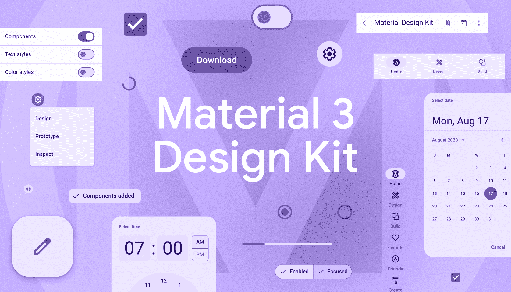
2. Updated Components and Design Tokens
Material 3 introduces a new set of UI components built with adaptability in mind. Design tokens allow for easier cross-platform theming.
Key changes:
Components are more responsive and scalable
Better alignment with accessibility standards
Design tokens enable consistency across Android, iOS, and web
3. Improved Typography and Layouts
Material 3 embraces new typography scales and layout guidelines that prioritize readability and adaptability across different screen sizes and device types.
Benefits include:
More breathing space for text
Clearer hierarchy for faster scanning
Dynamic layout containers for better responsiveness
4. Motion and Interaction
Material 3 emphasizes subtle yet purposeful motion to guide users through the interface.
Motion is now:
More fluid and natural
Used to provide feedback and orientation
Designed to support accessibility preferences (e.g. reduced motion settings)
Why Designers and Developers Should Care
Material 3 is not just for Android. It offers tools and principles that benefit multi-platform experiences. For developers, Material 3 integrates smoothly with Jetpack Compose, Flutter, and the Material Theme Builder. For designers, the new guidelines are available via Figma components and Google’s updated Material Design documentation.
Material 3 makes it easier to:
Design once and deploy across platforms
Provide a consistent user experience
Stay up to date with best practices in accessibility and performance
Accessibility and Inclusion
In 2025, inclusive design is not optional — it’s expected. Material 3 strengthens this by:
Offering better contrast out of the box
Supporting larger touch targets
Respecting user settings for reduced motion and larger font sizes
This ensures your UI is usable by everyone, regardless of ability.
Real-World Applications
From banking apps to health trackers, Material 3 is already being adopted by leading brands:
Google Workspace apps now use Material 3 with dynamic color
Spotify integrates motion and layout principles from Material 3
Fintech startups are embracing personalization features to improve engagement
How to Get Started
Explore the Material Design 3 documentation
Use Material Theme Builder to create dynamic color schemes
Integrate with Jetpack Compose
Final Thoughts
Material 3 isn’t just a design system — it’s a shift in how we build relationships between people and digital products. In a world of increasing personalization and accessibility demands, Material You brings both consistency and flexibility.
For forward-thinking brands, now is the time to embrace Material 3 and future-proof your design strategy.
Since its debut, Material Design has served as the foundation for countless digital products across Android, web, and even iOS platforms. But in 2025, Material 3 — also known as "Material You"— is setting a new benchmark in user interface design. This isn’t just a visual refresh; Material 3 is a philosophy shift, placing personalization, accessibility, and adaptability at the forefront of digital experiences.
The Evolution from Material Design to Material You
Material Design (Material 1) was introduced by Google in 2014, bringing a bold visual language with emphasis on layering, shadows, and consistent UI elements. Material 2 refined that with more responsive components and better usability.
Now, Material 3 goes beyond standardized aesthetics. It adapts to you — your device, your preferences, your environment.
Core Innovations in Material 3
1. Dynamic Color
At the heart of Material 3 lies its most celebrated innovation: Dynamic Color. This feature extracts a color palette from the user’s wallpaper or background and applies it system-wide. Apps automatically adapt to this palette, creating a highly personalized, cohesive visual experience.
Why it matters:
Enhances emotional connection with UI
Makes every device feel uniquely yours
Reduces visual fatigue with harmonious color transitions
2. Updated Components and Design Tokens
Material 3 introduces a new set of UI components built with adaptability in mind. Design tokens allow for easier cross-platform theming.
Key changes:
Components are more responsive and scalable
Better alignment with accessibility standards
Design tokens enable consistency across Android, iOS, and web
3. Improved Typography and Layouts
Material 3 embraces new typography scales and layout guidelines that prioritize readability and adaptability across different screen sizes and device types.
Benefits include:
More breathing space for text
Clearer hierarchy for faster scanning
Dynamic layout containers for better responsiveness
4. Motion and Interaction
Material 3 emphasizes subtle yet purposeful motion to guide users through the interface.
Motion is now:
More fluid and natural
Used to provide feedback and orientation
Designed to support accessibility preferences (e.g. reduced motion settings)
Why Designers and Developers Should Care
Material 3 is not just for Android. It offers tools and principles that benefit multi-platform experiences. For developers, Material 3 integrates smoothly with Jetpack Compose, Flutter, and the Material Theme Builder. For designers, the new guidelines are available via Figma components and Google’s updated Material Design documentation.
Material 3 makes it easier to:
Design once and deploy across platforms
Provide a consistent user experience
Stay up to date with best practices in accessibility and performance
Accessibility and Inclusion
In 2025, inclusive design is not optional — it’s expected. Material 3 strengthens this by:
Offering better contrast out of the box
Supporting larger touch targets
Respecting user settings for reduced motion and larger font sizes
This ensures your UI is usable by everyone, regardless of ability.
Real-World Applications
From banking apps to health trackers, Material 3 is already being adopted by leading brands:
Google Workspace apps now use Material 3 with dynamic color
Spotify integrates motion and layout principles from Material 3
Fintech startups are embracing personalization features to improve engagement
How to Get Started
Explore the Material Design 3 documentation
Use Material Theme Builder to create dynamic color schemes
Integrate with Jetpack Compose
Final Thoughts
Material 3 isn’t just a design system — it’s a shift in how we build relationships between people and digital products. In a world of increasing personalization and accessibility demands, Material You brings both consistency and flexibility.
For forward-thinking brands, now is the time to embrace Material 3 and future-proof your design strategy.
